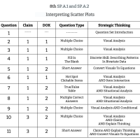
8th Grade Math - SP.A.1 and SP.A.2 - Interpreting Scatter Plots
11 Questions
Interpreting Scatter Plots Introduction
The graph below shows the correlation between the average amount of time people exercise and their age.
Which of the graphs below is showing a nonlinear relationship?
What type of correlation would the equation below show if this were the line of best fit in a scatter plot?
Type in the equation for this line of best fit using the format y = mx + b.
Click on two points that would represent outliers to this data.
The graph below is showing the relationship between the tardies given out by one teacher each period over the course of a week.
A grocery store wanted to know if the number of complaints they received was a function of the number of checkout lines open.
Part 1: Analyze the graph below. All points but one have been graphed. Determine the final point on the line using the criteria below.
Part 2: Andre was asked to create a line of best fit for the data. Did he do it correctly? Explain.
Felipe claims that the equation that represents the line of best fit below is y = -x. Do you agree with Felipe? Explain.
The question sets found here work best in conjunction with the Strategic Thinking in Math training for grades 1 - 8.
Learn more